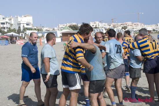
At the risk of upsetting the purists I will always argue that sometimes a photograph that captures the moment exactly as you saw it at the time is all that matters. we can strive for perfection all we want, but in many cases the raw material is often the best.
I spent yesterday afternoon feeling old as I watched the rugby beach tournament, and the evening proving I was old by drinking with them until the (very) early hours of the morning! I wont bore you with the sorry details but you can read more about them and see some pictures and a video over on Almerimar Life.
This particular match had some ‘history’ to it as it was between the local team El Ejido and a team from Burnley in the UK. The history is down to the fact that the coach of Burnley was the first coach of El Ejido until he went back to live in the UK. The two teams are good friends and this was the final group match to determine who went through to the knockout stages.
Burnley won and at the end the genuine friendship and respect came out naturally, and hopefully I captured it.
I have cropped it to focus even more on the players, and went for the Sepia look as I think it has certain ‘throw back’ tendencies so I wanted it to have a traditional, historic sort of look.
Anyway, comment away as usual.
Original Picture


Another great shot Chris, again perhaps a bit busy for my desktop tastes but I tend to go for the more bland wallpapers.
I think sepia is a good choice for this photo as-well, it seems to bring out the emotion a little…. but that could be just me :p
D
I like this a lot. Not as a desktop, as Danny said, it’s a bit too busy for a desktop. The sepia gives this shot a lot more contrast and “life”(?). It seems to me like you are getting better and better at this picture taking thing, Chris.
Cheers. I agree about the desktop, maybe I should change the post title for these to ‘Pic of the week’ or something?
Both ‘life’ and ’emotion’ were exactly what I was trying to achieve.
Yeah, I think pic of the week would definitely be a more suitable title 😀
Looks like a change of name it is then! Makes sense actually for another reason which I will ‘decalre’ at some later stage.
Make sure you go Web 2.0! Maybe “Weekendr Pic” 🙂
I agree with the others about the general issue of appropriateness of “desktop”, although the sepia treatment helps this image for that purpose since icons would stand out that much more against it.
I quite like this photo as a photo. I’m no great fan of sport, in general, so the content does little for me. You’ve got the “eye-line” working on the left to right upward slope (okay, so it’s not much of a slope, but so what?). I also quite like the way there’s a single face in the middle, while everyone else’s faces are either obscured or in partial profile at best
I’ve tried for sepia images a couple of times in the past (I seem to recall that there are several ways of achieving the effect) but was never really happy with the result. I vaguely recall that being partly down to the specific sepia tone values. You have got quite a nice result here.
As for Web 2.0? Nooooooooooo! 🙂
Am not so sure about the Web 2.0 thing either 🙂
What I liked most about the picture was the three one on one embarces and the way they created the whole ‘spirit’ of the game.
And yes – the single face in the middle made a good focal point which is why I cropped it to be in the middle.
For true web 2.0 Chris you want an AJAX photo viewer and link to all the photo sharing sites ever invented, along with code to allow users to embed the viewer in their web page :p
D
@Danny: I think/hope Wayne was referring to a style of naming.
I think I will just go with a descriptive name for each picture and publish them once a week as I do now, so this one for example I would have called Embrace, or Spirit.